Current projects
-

Bible Study Workbook for Ruach Emet (Spirit of Truth)
I am so excited to work on and share a glimpse of my personal project. I am writing Bible Studies that have been on my heart to do with my children. I am hoping they are good enough for me to share with others! I want the overall aesthetic to be feminine and elegant.
-

Landing Page for Dr. Fadwa Gillanders
I had the privilege to work with the amazing Dr. Fadwa. She is a Clinical Pharmacist of over 25 years and is sharing her wisdom and knowledge with the world. Dr. Fadwa specializes in Metabolic Syndrome.
-

Wiggins Insurance
Wiggins Insurance wanted a website refresh. They already had a logo and light branding done. They knew what they wanted and I helped bring their vision to life.
-

Get2theroots Logo
This image combines natural beauty and calming elements, which exude a peaceful, restorative, and harmonious aesthetic. The vibrant sunset with its warm, golden hues creates a sense of tranquility, while the lush green grass and the solitary tree evoke feelings of stability and growth. The tree, with its strong roots, symbolizes grounding, resilience, and connection to nature.
The text "Get2theroots" paired with "Spirit Soul & Body Restoration" reinforces a sense of healing and well-being. The overall mood is calming, peaceful, and nurturing, promoting both physical and spiritual rejuvenation.
The aesthetic could be classified as "natural wellness" or "eco-spiritual," focusing on holistic health and inner peace. The image evokes emotions such as calm, hope, and the desire for personal restoration and balance.
-

Get2heroots Website
I took all the same elements from the logo and incorporated them throughout the website to bring my clients vision to life.
-

Kate Posner Florist Logo
This logo features a clean, minimalist design with elegant and natural elements, making it very suitable for a florist brand. Here are the key characteristics:
Typography: The use of a large "K" as the focal point, paired with a clean and refined font for "KATE POSNER FLORIST," conveys sophistication and elegance. The simplicity of the font adds a modern touch while still maintaining readability.
Butterfly: The butterfly perched on the letter "K" symbolizes transformation, beauty, and nature. This element directly connects to the floral theme, suggesting growth, delicacy, and the flourishing beauty of flowers.
Floral Wreath: The surrounding floral wreath adds a natural, organic feel, reflecting the core of the business—flowers. The gentle curves of the wreath create a sense of balance and completeness, giving the logo a soft, welcoming aesthetic.
Monochrome Color Scheme: The black and white color scheme contributes to a timeless and classic aesthetic. This simplicity helps the logo stay versatile and professional while remaining elegant and easily recognizable.
Minimalist Design: The overall minimalist approach, with the clean lines and subtle details, gives the logo a modern yet timeless feel, which works well for a florist business aiming to portray sophistication and quality.
Overall, this logo exudes elegance, nature, and transformation, perfectly capturing the essence of a florist who values beauty, growth, and refinement.
-
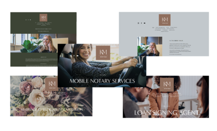
Notary Public Website Template
This website design presents a clean, professional, and cohesive aesthetic. Here's an analysis of its key elements:
Color Scheme: The use of muted tones such as green and gray, paired with the warm brown accents in the logo and text, creates a calming and approachable atmosphere. These colors reflect professionalism, trustworthiness, and simplicity, making it ideal for a service-based business like notary services.
Images: The images used throughout the website emphasize a personal touch, featuring people in different contexts (such as interacting with clients, driving, and in office settings). This suggests a focus on customer service and approachability. The combination of lifestyle imagery and business settings adds a human element that can help users connect emotionally with the brand.
Typography: The clean, modern font style contributes to the professional feel, while the bold text for sections like "MOBILE NOTARY SERVICES" and "LOAN SIGNING AGENT" enhances readability. The font choice is simple yet elegant, making it easy for visitors to navigate the site and understand the services offered.
Layout and Structure: The layout is well-organized, with sections dedicated to specific services such as "Mobile Notary Services," "Marriage Certificate Notarization," and "Loan Signing Agent." This helps visitors quickly find relevant information. The images that accompany the text in each section add visual interest and provide a break from the copy, which keeps the site visually engaging.
Consistency: The overall consistency in branding—logo placement, colors, and typography—helps create a cohesive experience for the user. It provides a strong, unified look for the brand, making it feel professional and trustworthy. The repeating use of the same background and text treatments further reinforces the website's identity.
User-Friendliness: The simplicity of the design contributes to a user-friendly experience. The website doesn’t appear cluttered, and the navigation between sections looks straightforward. This likely helps visitors find what they need without feeling overwhelmed, which is crucial for any service-based business.
Tone: The design has an overall tone of professionalism and approachability, reflecting the nature of the services being offered. It blends a modern and clean design with a personal touch, ideal for making clients feel comfortable and confident in the services provided.
Overall, the website design presents a balance of professionalism, warmth, and simplicity, creating a strong online presence for the business. It effectively communicates the services offered while maintaining a clean and inviting visual appeal.